Patreon LogoYour support makes Blue Moon possible (Patreon)

π•Šπ•’π•“π•–π•£'𝕀 π•„π• π••π•šπ•—π•šπ•”π•’π•₯π•šπ• π•Ÿ π•Šπ•₯𝕒π•₯π•šπ• π•Ÿ [NSFW]

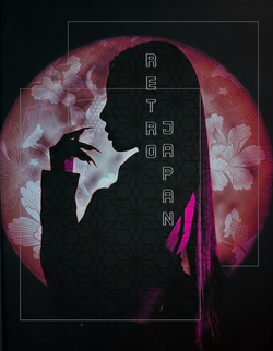
Retro things because I maybe got obsessed.
retrobrush.png
Fiddled with lighting, saturation and contrast, as well as color balance.
Texture texture texture
 
I'm a Little Monster is a bit uninspired. Not much going on there. Even if you were going for something quick and simple, perhaps a bit more could have happened here. At least something going on in the background. The frame might even make it look incomplete. Sometimes when you add an element like a frame, it will look kinda unfinished. Frames should be carefully considered as part of the composition and not just thrown down without much consideration. I see that you tried to do something with it, but why exactly is it there? What does it add to the composition, besides just being there? A frame contains or excludes design elements in a piece, but in this case it's not really doing much of either.

Your Retro piece is a better use of the frames. They aren't distracting and are a design element to help give the piece structure. It doesn't clash with the images at all, and the use of them both have a purpose-- they help create depth by being layered around the render instead of just existing on top of it. I've also seen the text version of this one, and I like the text version more. The bare version just feels like something is missing.
The short answer is I'm lazy T-T but i will take your frame advice into account. That's the first time I tried so I really didn't know what I as doing. I will try and add a frame to my next project and see how it goes.

With the text retro piece I was just unsure if I could post it. A weird anxiety thing, but! I am glad I made it. Did you like the placement of the text?
 
I literally made a piece with Retro's username on it. Just post it. Who cares? She isn't gonna like flip out and start screaming at you. It's a name, and a tribute to her.
 
I literally made a piece with Retro's username on it. Just post it. Who cares? She isn't gonna like flip out and start screaming at you. It's a name, and a tribute to her.
I have anxiety 😭 but ok
Also did you like where I placed the text πŸ₯²
 
Yeah. Text placement was fine.
200.gif
 
Well... just make sure you clean those panties and don't wear them for too long. Don't want a yeast infection.
 
you are brilliant!

i know this was for a steal your brush challenge, but u did this ! <3 marvelousness

it looks like an editorial out of a magazine. anyway, look how much you have grown and how inspiring your graphics are ~
πŸ₯² A hottie praised me
 
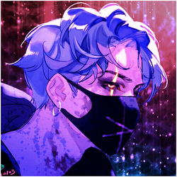
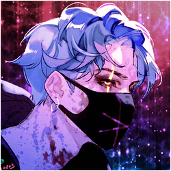
This one is not bad. The background is a little blurry in a low-res kind of way though, and not an out of focus, depth of field sort of way. Doesn't hurt it too much, since at the smaller size it display at on the site you can't notice it too much.
 

This one is not bad. The background is a little blurry in a low-res kind of way though, and not an out of focus, depth of field sort of way. Doesn't hurt it too much, since at the smaller size it display at on the site you can't notice it too much.
I changed the colors on my gradient a bit too to make it a bit warmer
trickster.png
 
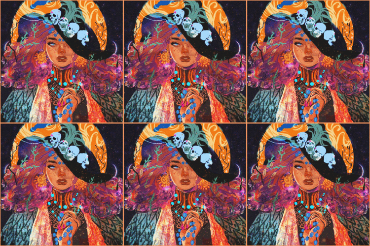
I see the light leak animation has made it's return. I have some issues with the way the gifs are used, because the blending modes will forever give them that washed out, faint look. However, it kind of works for this particular look.
 
I see the light leak animation has made it's return. I have some issues with the way the gifs are used, because the blending modes will forever give them that washed out, faint look. However, it kind of works for this particular look.
I'm a sucker for the light leak >.>
 
Back
Top Bottom