Patreon LogoYour support makes Blue Moon possible (Patreon)

π•Šπ•’π•“π•–π•£'𝕀 π•„π• π••π•šπ•—π•šπ•”π•’π•₯π•šπ• π•Ÿ π•Šπ•₯𝕒π•₯π•šπ• π•Ÿ [NSFW]

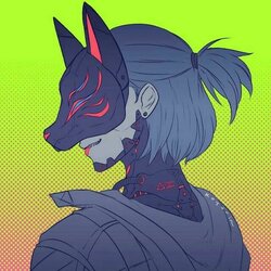
Avie and sig for
@MatchaMochi
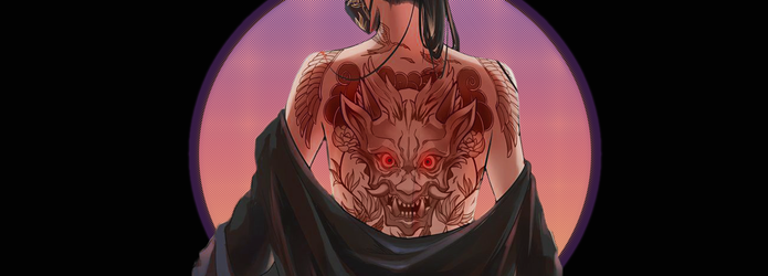
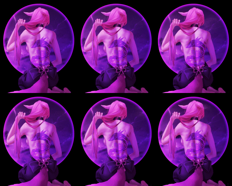
View attachment 21102

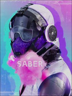
-gradient map in the background
-adjusted hue and saturation
-gradient fill
-scan lines
-sparkle animations
-border

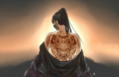
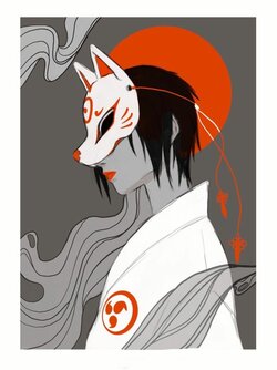
Original
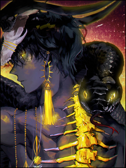
View attachment 21103

View attachment 21104
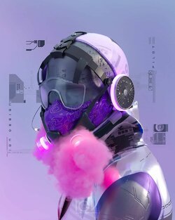
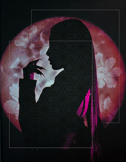
-adjusted color and contrast
-gradient fill
-diamond pattern fill
-water bubble animation
-border

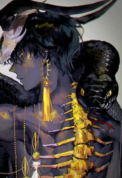
Original
View attachment 21105
Had to come hype them in public too, but these are so beautiful and amazing :heart: .Thank you so much for making them! (probably a millionth "thank you" at this point lol)

c61.gif
 
Had to come hype them in public too, but these are so beautiful and amazing :heart: .Thank you so much for making them! (probably a millionth "thank you" at this point lol)

c61.gif
I'm glad you are happy with them, friend πŸ₯°
 
New Profile Banner
profilebanner2.png

-Made brightness and contrast stronger
-Circle and gradient map with diamond patter fill
-Outter glow
-Brush tool to make the eyes look like they're glowing
-gradient fill


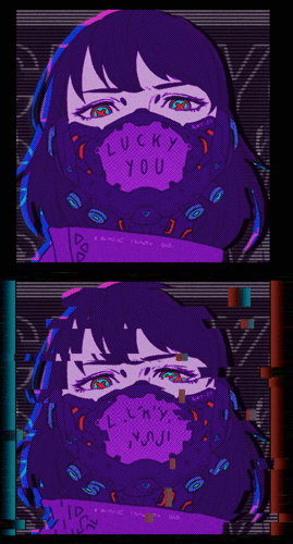
Made my first animation myself.
It was only two frames and pretty simple, but still :3
saberaviepurpmask.gif

-So much went into this so I'm going to just post the tutorial link
:)
-First time trying this so it could be cleaned up some but I'm definitely going to play with it a lot

View: https://www.youtube.com/watch?v=0wX9iXmMKwA
 
Not a bad first attempt. I'd make the chromatic aberration on the sides a bit more subtle. However, as an avatar, it looks fine. The smaller size helps to make it look less exaggerated. Also, I would add some of the glitch effect to the upper left and and right of the background square. Just a subtle touch to help those areas look less static, and to make the whole image look like it's glitching out instead of just the focal point. That being said, it might have been neat if JUST the focal point was glitching out and the background behind her was untouched. The contrast might have given it a more 3D sort of look, but not sure on that one.

It's nice to see you adding some animated bits to your work without plopping down a gif. I honestly figured it was only a matter of time before you tried to apply a glitch effect like this to something.
That tutorial was super nice and yeah when I watch it, it makes me wanna remake it with more effect and in different directions. Possibly with another image thrown in πŸ‘€ I'm getting ambitious, sensei.
 
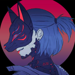
New Pfp
44313.png


- solid magenta color fill

-added layer with black fill

-elliptical marquee to make my circle

- gradient over magenta layer

- scan lines over black fill layer

-adjusted brightness and contrast to render


Trying some glooow
goldsnek.png

-just played around with brightness and contrast
-added some glow over the already golden areas on the subject.
-added a small outer glow
-added texture background with a gradient overtop with vivid light blend mode
-smaller checkerboard pattern fill

 
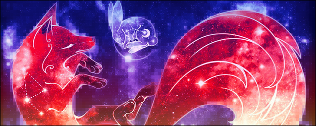
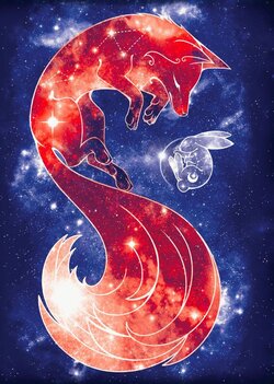
Just playing with some filter things
foxandbunny.png
-super basic edit, messed with contrast
-added pixel filter
-gradient map
-gradient
-scan line fill
-border.

 
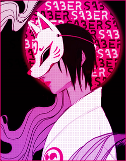
SABERSABERSABER
might make this my pfp in the future

kitsunesabermoretext.png
-masked out my subject

-filled in a black background
-elliptical tool to make my circle
-filled it with magenta
-all the text
-bold square pattern fill over subject
-gradient map
-scan lines over text/moon
-gradient
-border.

 
Oh! I love it so much! The storm effect is just... 🀀
 
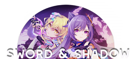
RP Title Banner
First Genshin related thing I've made in a while :3
swordandshadowtransparent.png
 
Retro things because I maybe got obsessed.
retrobrush.png
Fiddled with lighting, saturation and contrast, as well as color balance.
Texture texture texture
 
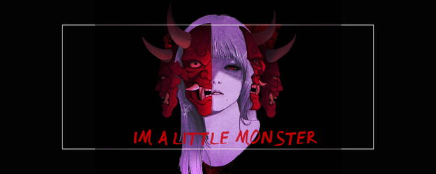
I'm a Little Monster is a bit uninspired. Not much going on there. Even if you were going for something quick and simple, perhaps a bit more could have happened here. At least something going on in the background. The frame might even make it look incomplete. Sometimes when you add an element like a frame, it will look kinda unfinished. Frames should be carefully considered as part of the composition and not just thrown down without much consideration. I see that you tried to do something with it, but why exactly is it there? What does it add to the composition, besides just being there? A frame contains or excludes design elements in a piece, but in this case it's not really doing much of either.

Your Retro piece is a better use of the frames. They aren't distracting and are a design element to help give the piece structure. It doesn't clash with the images at all, and the use of them both have a purpose-- they help create depth by being layered around the render instead of just existing on top of it. I've also seen the text version of this one, and I like the text version more. The bare version just feels like something is missing.
 
Back
Top Bottom