Patreon LogoYour support makes Blue Moon possible (Patreon)

π•Šπ•’π•“π•–π•£'𝕀 π•„π• π••π•šπ•—π•šπ•”π•’π•₯π•šπ• π•Ÿ π•Šπ•₯𝕒π•₯π•šπ• π•Ÿ [NSFW]

Afternoon Haiku
Languid hips, subtle
Hastened breath causes tense hands
Did you hear a bell?
 
Nighttime Haiku
The setting sun fades
Night brings forth flickering lights
A cry of despair


translation: someone died in anae's game.
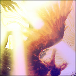
 
Been a minute since I did some photoshop cuz I been busyy
exorcist.jpg

I actually fiddled around with this a bit with lighting and I extended
the fog effect by myself and I'm pretty pleased with how it turned out.
-2 gradients
-scanlines
-only 2 images this time cuz I'm lazy
 
New Profile Banner I'm semi content with
Maybe play some more with it when I have more time.
neonsaber.jpg
-2 different textures, not including the square pattern
-no gradient, just wanted to see how it'd look
-text on the mask


A fool yearns for what burns
Call me a fool, for I will reach for the sun
As long as the sun continues to love me.

icarus.jpg

I will probably rework this at some point, some of the rays are off angle.
-3 different gradients for this and other than the scanlines, the
gradients did most of the work. If I rework, I will use
different gradients maybe.


Sensei taught me a new trick and I'm Obsessed
sabersig3.jpg

@Mitsu
Notice me Sensei πŸ‘€
Should I move my name?

 
Last edited:
Yes. In this case I would move it closer to the focal point.

unknown.png


You're using very bold colors and high contrast. The image is also very powerful. You want to use a powerful font to match it. Not only is placement important, but it's also important that your font selection matches the energy of the piece.
Oooo I like it. I moved and changed my font like 8 times lol why I couldn't figure it out I'm not sure πŸ˜… 😭 I think I over thought it. Also what font is that? πŸ‘€
 
For something small like a signature, it's usually a good rule of thumb to keep the text near the focal point. Either on the focal point or just off center, depending on the image used.
 
For something small like a signature, it's usually a good rule of thumb to keep the text near the focal point. Either on the focal point or just off center, depending on the image used.
I think I need to download new fonts
 
It would be a good idea. I'm a huge fan of sans-serif in general, but it's a good idea to have a nice selection to work from.
 
It would be a good idea. I'm a huge fan of sans-serif in general, but it's a good idea to have a nice selection to work from.
Other than the text, what did you think of the edit overall?
 
Kinda weak overall in terms of the design.

I like what you did with the gradient map on her to change the color around. Reminds me that I'm going to have to teach you how to do something along the lines of a color gel effect. You can see it in use in my Drive and Pixel Factory pieces over in my thread. I'll probably actually just link you to a tutorial or you can just search it up on YouTube. PiXimperfect has a real good tutorial on it. Like always, his stuff not only teaches you a great technique but a bunch of other small things too. Color gel might even give you some ideas to finally tackle a nice, large piece with a photo!

The dot pattern makes it look like it's printed or like an old PC game from the early to mid-90s. I really dig the look. You've made it subtle enough that it's not distracting, but anyone that really takes a look up close can see a great deal of nice detail.

However, where this one stumbles is the background. It just looks very messy and chaotic. There's too much going on in the space allotted for the background. You have a strong render, which takes up most of the canvas, so the background is competing here for the viewers attention. On the left side you can see that it's pretty much fine, because it just comes out from her shoulder. On the right side it gets hard to parse, because her hair and the background are both essentially thin strands jutting off in the same direction. It gives it the messy and busy sorta look I was mentioning.

Then, of course, the font selection and positioning is very off.

I also think the squished dimensions of the canvas does it no favors. If this were wider, then it would really allow it to breathe. You'd get the whole image of the katana and then the elbow and sleeve on the other side. The original image also does a good job of illustrating what to do with the area with the hair. Notice how they chose to use more solid slabs of red where her hair happens to be. There's some detail work there, but it's largely just planes of red for the hair to contrast against.

@Fruit is real good at hammering in that focal point and building around it. She's also good at lighting. I would suggest taking a quick look at her latest piece, or all of them, to kinda get a feel for some good layouts and useage of space. You'll notice that she's not affraid to allow the ends to fade out to black either. The empty space isn't always your enemy.
Bro I tested so many different backgrounds πŸ₯² I honestly considered leaving it black and I may go back and do that just to see what it would look like. I also chose the wrong canvas size in comparison with my last signature. Oops. I'm also really enjoying the subtle dot pattern it's becoming one of my go-to patterns. I will post a draft I had of the render on a different background that might have fit better.

Do you think if I made the image in the background bigger it would look better or messier? I liked how my scan lines looked on the background image so I left it alone after that
 
I would keep it roughly the same on the left side. Cut out the image and maybe move it to the right so that the body of the flower is covering that area where her hair is. Making it bigger might make it hard to see what the flower is. You should always keep in mind that you don't have to settle for much of anything in Photoshop. If you can't quite align the background how you want it, then you can literally make it align. Don't be afraid to take an image, cut it in two, and then move it to where you need it.

I would also maybe try adding a glow to the background image. A nice, subtle, red glow.
I just realized also if I make a draft with just a black background I could make my scan lines different colors as well which might be cool. Or do like a circle in the back with a gradient and scan lines similar to your Drive piece.
 
Yeah. See? That's what I'm talking about. Take ideas from other places. Get inspired and do just do stuff.
 
Just don't forget to change that text somehow. Nailing the background and the text will do wonders.
 
Just don't forget to change that text somehow. Nailing the background and the text will do wonders.
I'll look into more fonts I keep looking for the one you use but I didn't think I had it, but I must...right?
 
It's the rework for me
sabersig3.1.jpg

-Still some things I need to refine that I can fix once I resize
-removed other background to make my own
-Gradient map on render
-gradient fill in circle
-different font

@Mitsu @Fruit


Back
Top Bottom