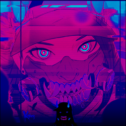
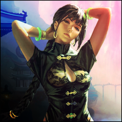
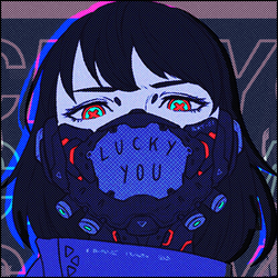
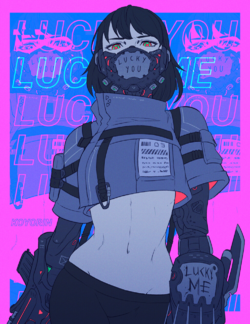
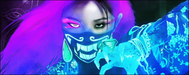
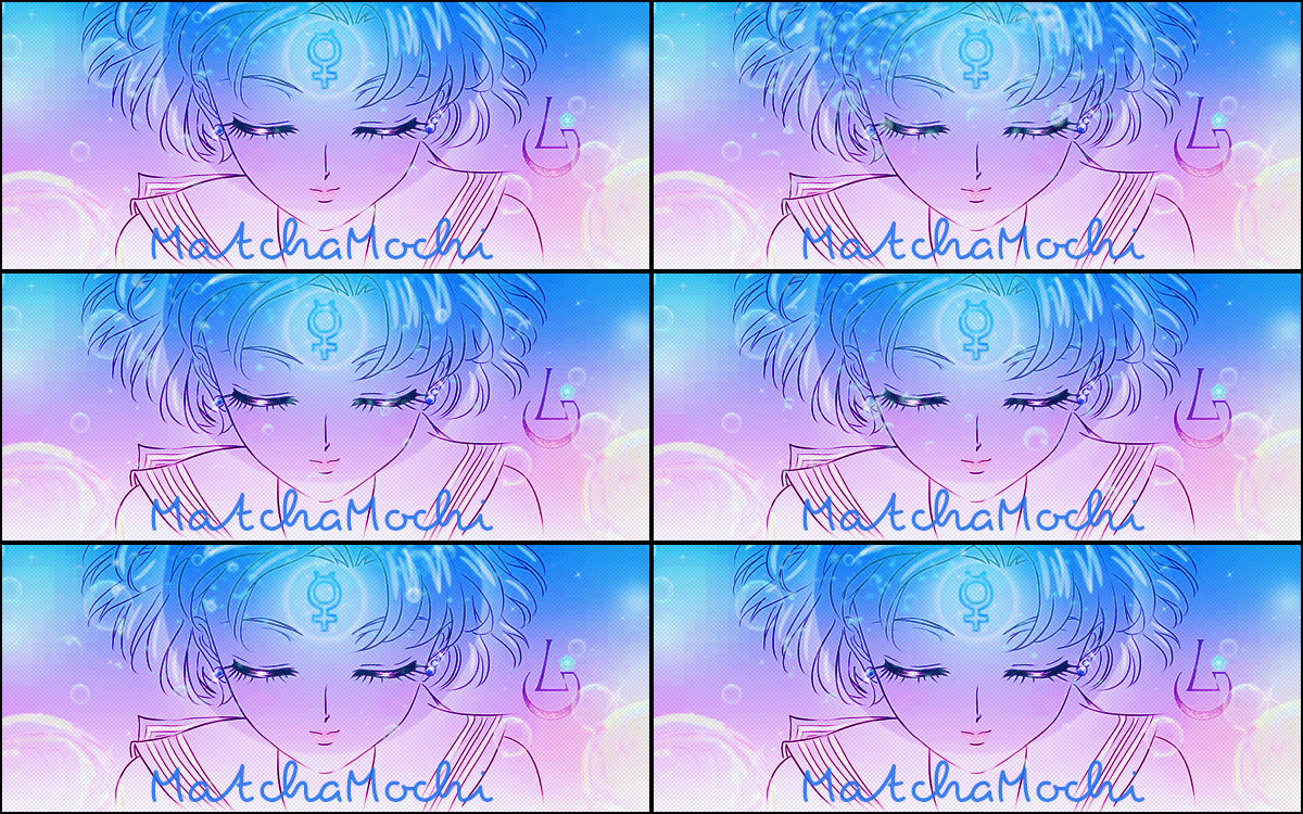
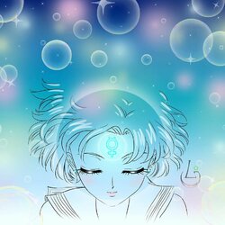
The new background and text are so much better. The circle makes everything look more centered and less cluttered, it also helps make the girl less purple. The previous background made it obvious that she's too saturated with purple but this circle kind of balances it better imo. I'm not exactly a big fan of the render placement tbh. The way she's positioned right now looks awkward because her arms are very thin, there is some weird gap near the bottom where you can see the background which makes her waist look awkward.
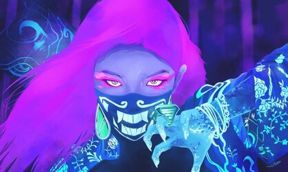
I feel like it'd look a bit better if you cropped out the canvas from her elbow downwards - it'd make the render more centered and you'd get rid of that awkward gap, also the arm would be less noticeable being further from the focal point.
This is what I mean but you'd need to move the text possibly:

Also try to save all your work in .png instead of .jpg.
I feel like it'd look a bit better if you cropped out the canvas from her elbow downwards - it'd make the render more centered and you'd get rid of that awkward gap, also the arm would be less noticeable being further from the focal point.
This is what I mean but you'd need to move the text possibly:

Also try to save all your work in .png instead of .jpg.

 Your support makes Blue Moon possible (Patreon)
