I'm just a baybee...but for real lesbians kissing under the mistletoe with santan hats?lol For you to think I'm so shallow and not a picky critic down to the most minute details. You truly are my sweet sweet summer child apprentice. So naive and so young.
 Your support makes Blue Moon possible (Patreon)
You are using an out of date browser. It may not display this or other websites correctly.
You should upgrade or use an alternative browser.
You should upgrade or use an alternative browser.
𝕊𝕒𝕓𝕖𝕣'𝕤 𝕄𝕠𝕕𝕚𝕗𝕚𝕔𝕒𝕥𝕚𝕠𝕟 𝕊𝕥𝕒𝕥𝕚𝕠𝕟 [NSFW]
- Thread starter Saber
- Start date
I'll do a batgirl/cat woman something someday in honor of youEhh... I'm not a big fan of Christmas.
Mitsu
Supernova
- Joined
- Oct 22, 2009
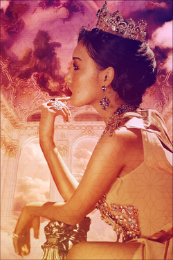
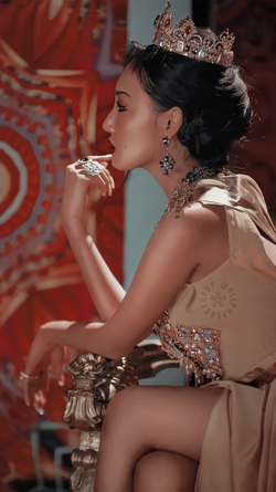
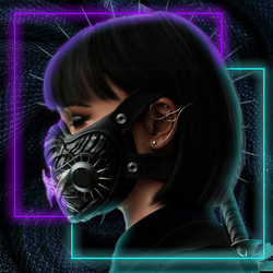
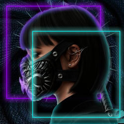
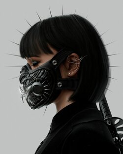
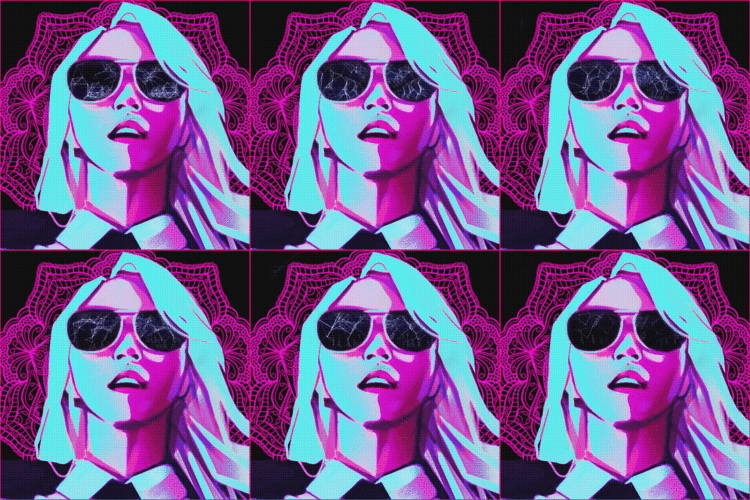
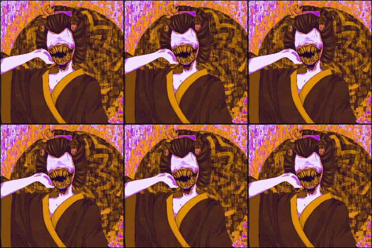
So, take a look at the original picture. The problem here is the original image has certain aspects that are out of focus: the background and some of subject. In your piece, her (the subject) arms are blurry for no reason, because the background is very clear. However, for the background to be clear and for her to be blurry, more of her would have to be out of focus. What we see in the original is an example of "depth of field", which your design outright ignores. Hard rules on how photography works aren't always things you must follow while doing this kind of stuff. However, as you can see here, not doing so can give you a weird result if you aren't careful.
Since the original image appears to take place in real, three-dimensional space, we see the effects of things like aperture, focal length and distance creating the depth that exists in real life. Look at your screen and notice how everything beyond it is now slightly blurry on the edges of your vision. Look beyond your monitor and notice how the screen is now slightly blurry. A camera lens can replicate this, and we see it at work in the original image.
This is a good example of how picking good images to render is very important. You want to pick an image that has crisp lines to cut out, and tends to be very flat. You don't want your render to be partially out of focus, otherwise you'll run into the problems you have here. With experience that will matter less, because you'll know how to blend things better. Such as adding feathering or blur to images manually to make things blend better, or intentionally creating depth of field to blend that some part of your render is also out of focus, and some other tricks (lightning, shadows, smearing, covering up, to name a few-- @Fruit is good at this).
Your selection of the arm is too fuzzy and feathered, so it looks awkward. Your selection of the nose and face is too crisp, so it lacks depth on the crisp background. The face is less of an issue, because you can just have a stylized image where the depth doesn't really matter. However, that arm is very distracting.
Next, I want to talk about that pattern you've dropped down. It appears as though you just dropped it down and likely set some blending mode. I highly suggest being more creative than that. Anyone can just drop a pattern down and change the blending mode. Take the time to do something interesting with it. Even if it's just isolating it to one section of the image, such as her skin, while also masking out her eyes and lips.
I will applaud you for getting rid of that watermark though. If you would have left that in, I'd have to create a wall of shame. lol
In the future, would you suggest blurring my subject and adding possibly another behind it? A collage-ish piece? Like if I were to make my subject a little larger, blur it completely and add another behind her?So, take a look at the original picture. The problem here is the original image has certain aspects that are out of focus: the background and some of subject. In your piece, her (the subject) arms are blurry for no reason, because the background is very clear. However, for the background to be clear and for her to be blurry, more of her would have to be out of focus. What we see in the original is an example of "depth of field", which your design outright ignores. Hard rules on how photography works aren't always things you must follow while doing this kind of stuff. However, as you can see here, not doing so can give you a weird result if you aren't careful.
Since the original image appears to take place in real, three-dimensional space, we see the effects of things like aperture, focal length and distance creating the depth that exists in real life. Look at your screen and notice how everything beyond it is now slightly blurry on the edges of your vision. Look beyond your monitor and notice how the screen is now slightly blurry. A camera lens can replicate this, and we see it at work in the original image.
This is a good example of how picking good images to render is very important. You want to pick an image that has crisp lines to cut out, and tends to be very flat. You don't want your render to be partially out of focus, otherwise you'll run into the problems you have here. With experience that will matter less, because you'll know how to blend things better. Such as adding feathering or blur to images manually to make things blend better, or intentionally creating depth of field to blend that some part of your render is also out of focus, and some other tricks (lightning, shadows, smearing, covering up, to name a few-- @Fruit is good at this).
Your selection of the arm is too fuzzy and feathered, so it looks awkward. Your selection of the nose and face is too crisp, so it lacks depth on the crisp background. The face is less of an issue, because you can just have a stylized image where the depth doesn't really matter. However, that arm is very distracting.
Next, I want to talk about that pattern you've dropped down. It appears as though you just dropped it down and likely set some blending mode. I highly suggest being more creative than that. Anyone can just drop a pattern down and change the blending mode. Take the time to do something interesting with it. Even if it's just isolating it to one section of the image, such as her skin, while also masking out her eyes and lips.
I will applaud you for getting rid of that watermark though. If you would have left that in, I'd have to create a wall of shame. lol
Hey! Motsu's ping brought me here c:
Nice work. Nice criticism from your sensei. I do want to share a tip, if I may. Editing in PhotoShop is categorized as either destructive or non-destructive editing. Destructive editing is (mostly) non-reversible changes that you make on an image. As in, once you exceed the limit of the actions you can undo in your history window, you can't revert back to an original stage unless you load an older version of the .psd. When performing non-reversible actions such as blurring, you really really want to save a backup layer so you can revert back if you notice a flaw in your design or simply want to restart and take your piece into a different route. Good luck!
Nice work. Nice criticism from your sensei. I do want to share a tip, if I may. Editing in PhotoShop is categorized as either destructive or non-destructive editing. Destructive editing is (mostly) non-reversible changes that you make on an image. As in, once you exceed the limit of the actions you can undo in your history window, you can't revert back to an original stage unless you load an older version of the .psd. When performing non-reversible actions such as blurring, you really really want to save a backup layer so you can revert back if you notice a flaw in your design or simply want to restart and take your piece into a different route. Good luck!
Sensei has mentioned that and I will do my best to keep it in mind more! I often don't work with irl images, but I've been trying to travel out of my comfort zoneHey! Motsu's ping brought me here c:
Nice work. Nice criticism from your sensei. I do want to share a tip, if I may. Editing in PhotoShop is categorized as either destructive or non-destructive editing. Destructive editing is (mostly) non-reversible changes that you make on an image. As in, once you exceed the limit of the actions you can undo in your history window, you can't revert back to an original stage unless you load an older version of the .psd. When performing non-reversible actions such as blurring, you really really want to save a backup layer so you can revert back if you notice a flaw in your design or simply want to restart and take your piece into a different route. Good luck!
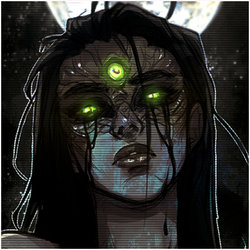
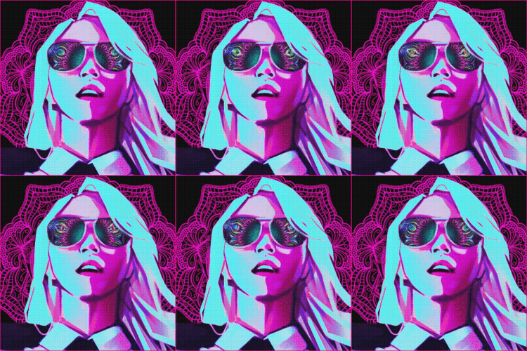
I'm not worthyProbably your best use of a gif in something, and probably your best avatar. Good job.
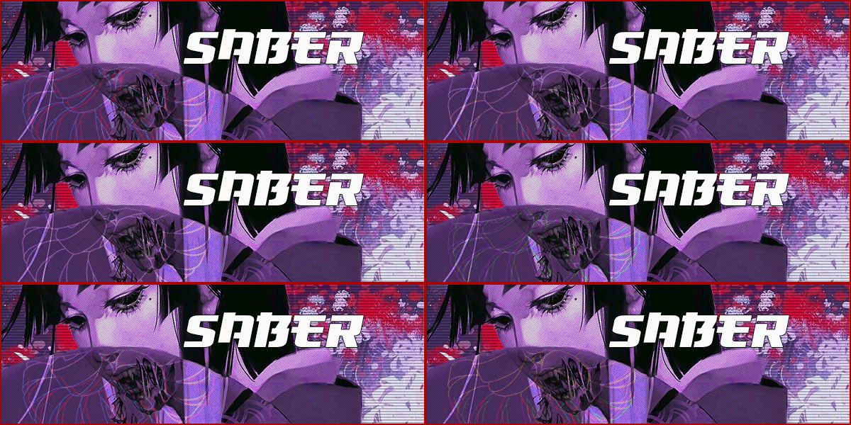
I really like that piece, Saber. The colors flow well, the animation loops well and isn't too overwhelming. I'd probably place the text a finger lower but that's the only pointer I'd give. The border is a very nice touch with a bold color that works perfectly. Great job!
Thank you T-T I did end up reworking it a bit. I'm still struggling a little bit with text placement sometimes, but I super appreciate your feedback!I really like that piece, Saber. The colors flow well, the animation loops well and isn't too overwhelming. I'd probably place the text a finger lower but that's the only pointer I'd give. The border is a very nice touch with a bold color that works perfectly. Great job!
- Joined
- Mar 28, 2020
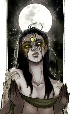
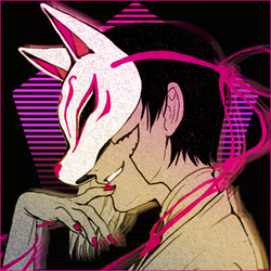
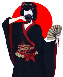
I made a retroI saw the image and couldn't help but think of @Retrojapan so I did the damn thing.
View attachment 24398
This is so Retro is literally hurts. I said it before and I'll say it again - I AM NOT WORTHY and I am gonna wear the Retrojapan out of this.


