Patreon LogoYour support makes Blue Moon possible (Patreon)

~Fruit Basket

Fruit

Best Girl
Joined
Jun 21, 2012
Location
next door
way
5rUBciO.png

I've been doing graphic designs in PhotoShop since about six years now. I don't design as much as I had used to, and my skills deteriorated with time and lack of practice but I often find myself coming back to designing whenever I feel bored. If anyone likes anything there, just grab it and credit me when you use it. Just don't grab something made for someone else. You'll notice most of the signatures don't have text, and most of them need text to fill some space. I can do that for anyone who wants that added. Lets make things clear, I'll be using this thread mainly to fish for compliments and whore for criticism :p For requests, please visit my official request thread here .​


way
 
Last edited:
Request from Victorian Virtue
YiCySIy.jpg


Lindsey Stirling Themed Update[/color]]
BV3el46.png


RaEuqXQ.png


NbxxPuL.png


W2m4O4q.png

Just a reminder, I happily take requests for avatars and signatures​
:)
 
Nice work. I may be wrong here, but does the effect you seem fond of consist of a texture or image set to overlay? Just wondering what exactly you do to get the sort of shimmery look.
 
Mitsu said:
Nice work. I may be wrong here, but does the effect you seem fond of consist of a texture or image set to overlay? Just wondering what exactly you do to get the sort of shimmery look.

Thanks.

That's one thing I typically do. I blur the part I want then fade the blur and set it to overlay. That, or I duplicate the entire image and set it to overlay then adjust the opacity. I also usually add a layer with black/white brushes and set it to "soft light" to play with the lighting.

But yeah, overlay is a pretty awesome blending option specially that I like dark and warm colors.​
 
No problem.

I kinda thought it was something along those lines, but I hadn't guessed the blurring part; it isn't a technique that I use all that often. Perhaps I'll give it a spin the next time I create something myself.

Personally I think I like the fourth signature down the most. I would have liked the third one the most, but it there's too much scratchy white on the black background. It almost makes it more difficult to look at, which is a shame because the composition is good. That piece would have worked really well as a super clean and slick design without any noise-- as if she has obsidian stone behind her, rolling like her body. Maybe play with contrast a bit, and darken up parts of the background too to make your lighting pop more.

Anyway, those are just my thoughts. I don't mean to criticize you in a negative way or anything. I do have another question, however. How do you save your work?
 
Mitsu said:
Personally I think I like the fourth signature down the most. I would have liked the third one the most, but it there's too much scratchy white on the black background. It almost makes it more difficult to look at, which is a shame because the composition is good. That piece would have worked really well as a super clean and slick design without any noise-- as if she has obsidian stone behind her, rolling like her body. Maybe play with contrast a bit, and darken up parts of the background too to make your lighting pop more.

I agree. I actually didn't notice the white noise on the render till just now. *facepalms*

Mitsu said:
Anyway, those are just my thoughts. I don't mean to criticize you in a negative way or anything. I do have another question, however. How do you save your work?

Shame, I was looking for constructive criticism :p

.png or .jpg. I honestly don't see the different half the time, so I just save it with whatever I have on default. Unless for when I have transparency, then its always .png obviously.

Oh, and most of my experience is with videogame/anime renders. I'm only starting to get to work with real renders and I find it quite a challenge. I think they look better simple, yet that means there isn't much to do other than play with the lighting and crop the right angle. When I add C4Ds and textures, I either overdo it or don't do enough and fail at blending. Which is why I post few of what I make xD Any suggestions for working with real renders?
 
If you have the .psd you can probably make a run at fixing it. I have no real idea what's causing it, but nothing is permanent if you've been using your layers correctly.

I've run into people here that have freaked out big time if I've given them any kind of constructive criticism, so I try to be a little bit more cautious.

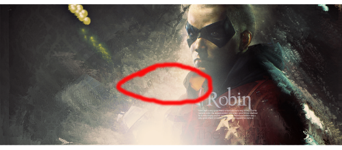
Ahh. Do you go to Save for Web, and the optimize the compression to keep it as high quality as possible? Just checking, because it is something that is sometimes over looked.

As for the difference here's a small test for you:

Jack%20-%20ava_zps8res2zbm.jpg
MyHappyWorldI.png


If you cannot tell the difference between these two images, then I would be highly surprised. It's essentially the difference you get between low quality .jpeg and high quality .png.

In my experience, it's more of the same stuff. So long as you have a render that has some flow to it, all you have to do is utilize the same techniques you've always used. You can switch out the anime girl in your first signature above with the face of a cute girl, and get the same sort of result. The blending is all the same (smudge, ripple, destruction brushing, ect), the placement rules are all the same (rule of thirds and so on), and the theory is all the same (contrast, complimentary colors, lighting, depth). There isn't that great of a difference, except that cutting out hair is even more of a pain in the ass. As always, it's a great idea to just look at what other people have done, or to look up some tutorials.

Take a look at this tutorial for what I mean on blending. It's the same techniques you'd use on an anime or game render. http://chaos-tutorials.deviantart.com/art/BEAUTY-Signature-Tutorial-86005328

http://abduzeedo.com/ - Great site for general, professional design tricks and inspiration.

http://bakarenders.com/renders/index.php - Full of pre-made renders, only have to join it for free.
 
If you have the .psd you can probably make a run at fixing it. I have no real idea what's causing it, but nothing is permanent if you've been using your layers correctly.

Oh I know what it is. I just haven't noticed it till when you mentioned it. It's a texture layer. I have it on top of her for blending purposes but I guess I forgot to erase enough of it or lower its opacity.

I only save .psds if it was a request from someone who does GFX design so that they can edit it if they wanted.

I've run into people here that have freaked out big time if I've given them any kind of constructive criticism, so I try to be a little bit more cautious.

As long as it is constructive criticism from an experienced designer like you, I don't mind. I've once had someone annoy me with criticism on lighting for months till I improved, so I appreciate that, even though he was obnoxious and his works were terrible xD

If you cannot tell the difference between these two images, then I would be highly surprised. It's essentially the difference you get between low quality .jpeg and high quality .png.

Oh I can, but I don't think it is always that easy to spot the difference and half the time the difference isn't worth it. Maybe it shows better in certain color ranges or distortion effects, I don't know. But yeah I think the example you used shows it better. I usually don't fiddle with the quality option when I save in a .jpg so the quality is usually 60.

I think I'll just stick to .pngs now. Safer choice. Also thanks for the tutorials I'll check em out.
 
Randomness![/color]]

RWZBbJ3.jpg
RUaZDRG.jpg


iOnfxU6.jpg


8VXke9w.jpg


IMjZME1.jpg


vv3hRQM.jpg


5udM3dI.jpg


vuVoyXL.jpg


ecDrTPn.jpg

Requests![/color]]
Someone wanted this with the render being of her choice:

EywF6S8.png


WolfQueen's request:
wJkwfrZ.png


I made two versions of her signature. It was challenging working with so much text but I'm glad she liked it :)
iBxW7F0.png

Again, requests are welcomed :)

 
Batman Themed Update~[/color]]
Batman
9c9g6j2.png


Catwoman
MkafccZ.png


Harley Quinn
1soOM5p.png


aQASPsU.png


I made two versions of Robin's signature 'cause I couldn't which looked better. One has
too much space and the other has distracting text. The render was bad quality so it was challenging to get it to blend.


9pSvDo1.png


ZtzD0Uj.png

Requests, comments, questions and criticism are all equally welcomed :)

 
The Batman signature is probably the strongest in that set, followed by the second Harley.

I would have raised the text in the Batman up a little bit. It would have given it a more together and compact look. I would have cleaned up the effect a bit around his face, so it doesn't look as though his chin and mouth aren't splitting into two smaller chins and mouths. It just creates a confusing image and can look a little silly. Blending looks good. The background could have used a bit more black, some more contrast, and perhaps some blurring to create depth. I think the massive light/white area above him is just a little bit too much, because there really isn't any contrast or darkness. I'm also not so sure about the inclusion of pink into the light.

Did you intend to make the side borders different sizes on the second Harley? Also the flowing lines on the right seem disconnected and just are sorta floating out there all disjointed. Having them closer to her body, or coming out from behind her would have added some more cohesion to the piece. It's the one aspect that the signature above it did much better. Next I'd like to mention that the harsh, yellow/gold lighting that you have coming down above her head is less than flattering. I would have gone with a different color, or just a neutral white. Perhaps it would have worked under the conditions of my next point: the render looks too high. I would have moved it down more, so her forehead isn't cut off at the edge of the image. While it can be effective, to cut off a face at the vertical half, or just below the eyes or nose, here it just looks awkward. It makes it look as though your image slipped up a bit accidentally and out of frame. Notice how the placement in each of your other signatures in the series looks more natural.

I would have placed the Robin text to the left of where his shoulder and cape meet, sort of in that white light. Making it work there would have been pleasing to the eye and given a compact, composed look. Instead the text looks like it's floating out in the distance, or awkwardly stamped onto him. The content of the picture is already heavily towards the right of the image, so placing the text closer to the left is a good idea, otherwise it looks cramped. You just have to make sure it isn't too far away from his body, a concern you already had.
 
Duly noted. Thanks, Matsu.

I'm so happy I've made .psds this time :p I've fixed most of the flaws you've caught and uploaded fixed versions in my earlier post.

Did you intend to make the side borders different sizes on the second Harley?

I did. Was it a bad move?

Next I'd like to mention that the harsh, yellow/gold lighting that you have coming down above her head is less than flattering. I would have gone with a different color, or just a neutral white. Perhaps it would have worked under the conditions of my next point: the render looks too high. I would have moved it down more, so her forehead isn't cut off at the edge of the image. While it can be effective, to cut off a face at the vertical half, or just below the eyes or nose, here it just looks awkward. It makes it look as though your image slipped up a bit accidentally and out of frame. Notice how the placement in each of your other signatures in the series looks more natural.

The head is cropped in the render itself. I had to place the render the way I had, or at least I think so. The yellow lighting is also part of the render and I had decided to use it in the signature rather than alter it. The fixed version I've just added makes it as white as I've managed without making it look bad.

http://s6.postimg.org/bh5u2c9j5/Batman.png
http://s6.postimg.org/gm71jymgx/Harley2.png
http://s6.postimg.org/zbz10pf7l/Robin1.png

Thanks again, Matsu! :)
 
It looks unusual to the eye, because it can be an unusual move, but I can't say it's inherently bad. We are very used to the borders we place around our pictures as very orderly and even. It's a stylistic choice. If you like the way it looks, then no point in changing it.

I see, I guess there's no way around that Harley bit, huh? I guess you've done no foul there with the placing of it, but I would have decided against using the render. Sometimes it's the render itself that can be the poor choice. I would have used that for an avatar, or some other design where I could cut it off at a place to make it look more natural. Below is an avatar I whipped up, using the image untreated:

Harley-Quinns-untreated_zpshxstgopt.png
Harley-Quinn-II_zpssenpdpby.png

In that framing the cut off of the head isn't so jarring. We are already missing tons of other information: the rest of her body. This allows us to more easily accept that it's supposed to be framed this way. When you see more of her body, but the top of her head is cut off, it feels less intentional regardless. That's how I feel about it anyway. Next I'll show you how I would actually frame an avatar out of it, to show you how much of a difference I believe it makes.

Harley-Quinn-unedited-2_zpsf3r3zen3.png
Harley-Quinn-II-vr2_zpsabh1aks1.png
Harley-Quinn-vr6_zpshicxgkgo.png

Suddenly the image has a different mood. It's more mysterious, and possibly mischievous. It'ls all personal prefrence, but I happen to like the version without the eyes. Of course avatars are a million times easier, but I just wanted to give an example of how framing can make a difference.

A for Robin, I wasn't clear enough. My description was kind of vague! Try placing it where I have circled below:

Untitled-1_zpsfpnvggtg.png

Just that general area will give it a better balance. It's okay if part of the text touches the render and part of it doesn't. Again it's subjective, but my eye tells me that kind of placing looks more natural. You can kind of see it in my current signature, and in this Batman one I've made below:

theBatman-vr2---sig_zpsh3kmh1kh.png
 
Of course, the render is obviously more suited for an avatar. I thought I'd take my chances and try and make a signature out of it because avatars are boringly easy xD I thought if I had placed it near one of the 3x3 intercepts it would work out well. I personally thought it did; I didn't mind the cropped forehead. In fact, other signatures in the same patch had cropped foreheads and it didn't matter. Perhaps this time it is because of the lighting source that aligns with it and has thus gave it more attention. It's funny that we have different opinions here because I thought the Batman signature was the worst in the update. I even contemplated not posting it. I much prefer the Harley sigs to be honest. My main concern with the second Harley was how her chin turned weirdly sharp/pixelated when I downsized it, not the golden lighting or the chopped forehead.

I fixed Robin's text. I had thought against placing it so near the light as it might not look clear against such a similar color. I had to place a drop shadow and play with the opacity but I think it worked. Thanks Mitsu, it does look better now.

Your Batman signature looks nice. His face is a bit too saturated for my liking but it doesn't take from the signature too much. I like the text; I usually go for more subtle text because I get worried flashy might overcome the focal point but in this case the proximity fixes that.
 
It's not always a sin to have a cropped forehead. I just think that sometimes it looks worse, and sometimes it's hard to work with. For that particular Harley Render I found it very noticable. Perhaps it was because of the lighting, as you speculated.

I like the Batman signature, because there's blending, some lighting, and it's very readable. The first Harley signature looks disjointed. It looks like a render placed on some random brushes, which is ontop of a gradient. There's no cohesion, nothing that pulls all of the parts together. The Batman piece looks like a cohesive whole, as if it was painted or drawn to all come together neatly like that. The Love Happiness and the Black and White piece in that series both are good examples of blending the picture into the background to make a composed, smooth piece. The things that pop pop, and the things that compliment the render do so. Everything looks deliberate, and as if it belongs. Your Robin piece also does a good job of this.

I'd say the first Harley Piece and that purple one above Sakura are your worst pieces, because they don't do things you've done so well in other places. This is, again, completely subjective. You could think I'm just out of my mind.

I made Batman's face saturated, because I wanted it to be harsh. I wanted it to give an intense and even "scary" vibe. I tried to give the illusion of some kind of motion, by having the spikes come up, as if he had landed so hard as to deform the environment. He landed hard, looks scary, and is about to drag you to a hell of pain. That was the intent, anyway. The success of my work is very dependent on the way other people view it. If I'm the only one that thinks that the things I do are good, then I'm all alone. It isn't always smart to heavily rely on making "art" to appeal to the tastes of others, but those tastes do matter. There's no point in publicly presenting something if nobody likes it (unless you are looking for criticism). At the same point, I should be weary of receiving nothing but compliments.
 
I've decided I'll keep this thread after all. I'll just use it as a place to throw in doodles I make. My official request thread will cater requests and questions. Comments, questions, and criticisms are greatly welcomed here as usual.

Triss Merigold is probably my favorite character in the game, but unfortunately I've only found one low-res render. I did what I could with it:

Ox0jL0s.png


Geralt of Rivea,

Fx9ZLk0.png


Ciri :heart:

XPgTuPE.png


EkbmkB4.png


Yennefer because why not; I don't like this one too much.

n7oP9oT.png


I've also made some color swaps.

* Natalie Dormer [Original - Redhead]
* Ashley Benson [Original - Witch]
 
That Ciri one is pretty damn good. I'd be hard pressed to do anything better. All around pretty good work.
 
Thank you for your kind words, Mitsu :blush: That Ciri render was a bitch to blend lol

WL1fWXS.png


I've been designing a bit the past few days. I also had so many requests but most of which were simple tasks like saturating a stock image or just fixing stuff. I don't quite like this patch, I even considered not posting those, but I felt I needed to update my gallery anyways.

If anyone has good quality renders I can train with, please send them my way. I can, of course, find many HD renders online but finding one that has proper orientation and little space/gaps is a bit difficult.

Request, a small and low quality render, but I think I wrestled my way around it. This is the first signature that I planned/envisioned before I started working in months haha. I usually just mess around and improvise;
Xxhonvg.png


Claire from RE, I didn't do the render justice. The background could have been better.
5Hm8b1j.png


Sheva from RE5, the render orientation wasn't ideal, but I wanted to practice brushing.
lfaIJUn.png


Ellie from Last of Us, the most badass female character ever :heart:
LeNCGyv.png


FbrAK7O.png


Random signature. I played with the shadows and the hair color a bit
gsEAdVg.png
 
Re9xx6k.png


zM4KW8j.png

jGeck0E.png

tvbRIil.png

OS4qyIz.png

vELKXaH.png

hlPIUBw.png

FRUALEz.png

L4zf0kB.png

r2YubNL.png

zekVg8R.png


I'm always welcoming requests.
 
The first Celebstars signature is my favorite of the bunch. Pretty good work as always.
 
Update time~

I'm actually rather proud of this patch. When I design, I usually open up PS and fiddle around until it looks decent. I don't usually have a clear picture of the end product when I start, its usually a step by step improvisation thing. This update is the first one in years where I actually knew what I wanted the end product to look like before I started :)

Father Figure request:

Ava: http://i.imgur.com/fDwlaP4.png
Sig wo/text : http://i.imgur.com/A3SbEOp.png
Sig w/text: http://i.imgur.com/KFYgmQD.png

I feel I could have done better with the text. The font seems oddly out of place. I often struggle with text anyways.

My current set,

Ava: http://i.imgur.com/4SXpfYf.png
Sig: http://i.imgur.com/A0JKuCr.png
Sig ver2: http://i.imgur.com/pHZbCPT.png

I don't know which version I like more.. help?

Stuff I've used the past few weeks:
Pharah Signature: http://i.imgur.com/6Y05yke.png
Ana Avatar: http://i.imgur.com/vuXN2qk.png
^ This took me so much time because I actually colored it >,>
Ana Signature: http://i.imgur.com/WirgeJ2.png

Random sigs:
http://i.imgur.com/4P4BqpB.png
http://i.imgur.com/qrcUB5G.png
http://i.imgur.com/deAOy7j.png

NastyFlame wanted an avatar. His only specifications were that he wanted a blonde guy in it. I was so tempted to make a king Joffrey avatar
 
Recently had four design requests, thought I'd throw them here to see if people had questions/criticism/suggestions. Also added comments for my PhotoShop buddies here.

Dayzee Signature (Source):

n4sSNOm.png


I thought of surrounding Enchantress with smoke and cinders the minute I saw the source picture. I envisioned it a little bit differently, with more shades of crimson and yellow around the clouds, but I think it turned out alright. I wonder if I should have made her face b&w instead of the yellow hue it now has.

HeyThereLittleBear Set (Sources / Discarded Draft):

hrMXV1I.png

ilhoCfZ.png


This one was a bit tricky but I'm very pleased with the end result. I had to render the girl because, although the source had a nice background, it wasn't going to fit with the other source pics/theme. The background was mostly brushed. The flowers around the girl were a last minute addition; a brush as well. The discarded draft has more bronze because I thought it looked too b&w, but the end I settled for the b&w version because I thought it fits the theme better. I wanted the girl to 'pop out' as opposed to the whole thing looking pale, so I had her in warm colors, and with bronze added to the background, it looked a bit too flat for my liking. Her arms and hair were blended with filter smudging, first time trying it that way.

how_is_you Signature (Sources: Akuma - Ryu / Discarded Draft )

6iGH5Xp.png


Simple brushing, coloring, rendering and messing with the lighting. Working with two renders is hard, and it is harder when they have to look like their fighting, but with the space they cover it was easy to not focus too much on the background. Most of the time was spent blending and adding the flame effects on Akuma's arm. That was done by a combination of brushing, smudging and distortion maps.
 
Welcome Sign;
U7EcZq2.png


Actresses:
vdrOK2l.png


Singers:
yYMewch.png


YouTubers:
gBCh7mg.png


Sportswomen:
qWc6zau.png


Gamergirls:
S1bCxFJ.png


Regular People:
gJjHgX5.png


Kinks & Plots:
GwMfyNY.png


Avatar:
k3yswyU.png


Signature:
RSE9EqY.png


So there was no way to include her face in the signature unless it was angled in a very bizarre way. So I went for this look, I think hiding her face makes it look more mysterious with a sexy vibe. I usually go for soft designs when doing real people and more effects with fictional characters, so I went for a clean looking avatar/signature.

A lot of the headers was a practice of goold ol' rendering. For some of them, the girls' heads in the source pictures were cut off. So I did the unthinkable where I took another girl's head from another picture and blended them together. You can tell if you inspect one of the pictures closely, but I'd doubt you'd tell the other one, lol. *is so proud rn*


dynhw9l.png


rhhiVrE.png


Extremely lazy set. This only took me <10 minutes of work, but I'm pleased with the result.


P.S Shout out to Sugo for making me an awesome .gif set.

+ I'm currently occupied with RP posts + revamping my own request thread. I still welcome design requests but I'm not likely to complete them till I finish what's on my plate (x
 
Back
Top Bottom