 Your support makes Blue Moon possible (Patreon)
You are using an out of date browser. It may not display this or other websites correctly.
You should upgrade or use an alternative browser.
You should upgrade or use an alternative browser.
pixel factory | PHOTOSHOP
- Thread starter Mitsu
- Start date
I love this so much T-T
Oh that one is lovely. Part of me wishes you used a different face composited on the subject; one with more contrast so it "pops" more, but I'm also so in love with how sharp her features are that I think it works extremely well. Its such a nice piece overall I can't stop staring at it! c:
Mitsu
Supernova
- Joined
- Oct 22, 2009
I love this so much T-T
Thanks. It was a practice piece that did not quite turn out how I wanted, and then I fucked up a certain step. I ended up just deciding I was done with it and posted.
Oh that one is lovely. Part of me wishes you used a different face composited on the subject; one with more contrast so it "pops" more, but I'm also so in love with how sharp her features are that I think it works extremely well. Its such a nice piece overall I can't stop staring at it! c:
I just cut the face out of the original image. It was very low contrast and super bright after doing the things that I needed to do to it, so that's actually the contrast version. lol
The original draft had a waterfall coming out of her detached face/mouth, but I wasn't pleased with the effect. I realized that it was a bit of a pain to extend it all the way down, and even more of a pain to actually make it look like it was hitting the sand. Instead I made a pivot and went with a more stylized interpretation. There was another version still that had the rainbow have some dust and cloud effects blended in with the more solid and hard bands. It almost looked like she was breathing fire, but some things went wrong and I lost it all. lol
Last edited:
You're right, I love these
Mitsu
Supernova
- Joined
- Oct 22, 2009
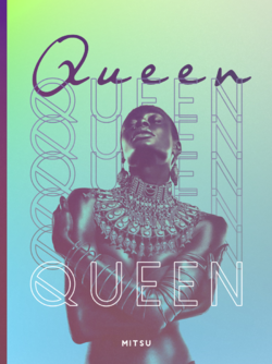
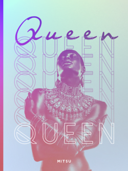
Thanks. I was figuring you'd really dig the "typography" that I threw down.You're right, I love these
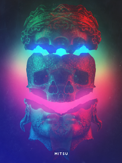
Thanks. While making those two, I was trying very hard to do something a bit darker and different than the usual. So I composited the scene with a few pictures and then worked hard at getting the lightning to work out. Then I randomly threw some stuff down to get the look of the second, and was stuck with a result I found I liked a bit more. lolThose are all amazing! I especially adore your second Panzer Kunst one. Keep it up Motsu!
I've had a problem lately where I feel as though my stuff all starts to look the same. Even worse is that I feel as though I'm not allowed to make anything that is derivative of my other stuff. I did three pieces in the same style, and it felt as though it was a lazy and not-so-good move to make. Perhaps I'm being too harsh on myself. I suppose I often think, "well they're gonna just think that I do the same thing every single time, so none of my stuff is any good."
You 100% are being harsh on yourself. The idea is to make graphics for your own enjoyment. You shouldn't feel like you have to make drastic changes to your usual style.
Besides, it is a lovely style and you keep perfecting it more and more with each piece you make c:
Besides, it is a lovely style and you keep perfecting it more and more with each piece you make c:
Mitsu
Supernova
- Joined
- Oct 22, 2009
I think there's more than just making things for my own enjoyment. If that were the case, then I'd probably have no desire to post the things I make publicly. There's an element of making things that other people would like to view, or showing off a piece to garner praise. I don't think I'd be very intellectually honest if I were to say that I was solely making shit just to fulfill some creative desire within me. There's a mix of things. I certainly don't make things for praise or for other people to the extent that it rules what I make entirely. If that were true I'd probably make things far more often, even when I'm not in the mood. However, I don't think I can ignore that aspect of it, and it weighs heavy on my mind when it comes to style, but perhaps not concept.
The colors
I'm enjoying the vibe with this


