 Your support makes Blue Moon possible (Patreon)
You are using an out of date browser. It may not display this or other websites correctly.
You should upgrade or use an alternative browser.
You should upgrade or use an alternative browser.
pixel factory | PHOTOSHOP
- Thread starter Mitsu
- Start date
- Joined
- Mar 28, 2020
This just gives me warm vibes
- Joined
- Mar 28, 2020
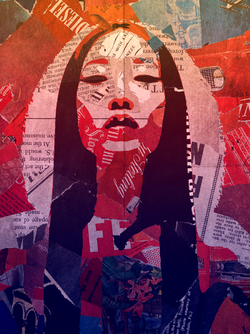
This is my favourite thing you've ever made
- Joined
- Sep 9, 2015
- Location
- ʙᴀ ᴅᴜᴍ 𝙩𝙨𝙨
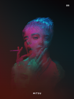
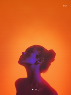
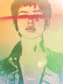
This is your best work yet imo. I especially like the seamless transition from warm hues at the top to the cool hues at the bottom, and how it fits with what you picked to reconstruct the hair/outfit. Really cool stuff!
Mitsu
Supernova
- Joined
- Oct 22, 2009
Thanks thanks. I had a feeling you'd dig it.This is my favourite thing you've ever made
Funny you say that. It's just a practice piece, so I didn't really think too much of it. There was actually no outfit in the source image. She was naked, presumably. I just wanted it all covered in the collage effect.This is your best work yet imo. I especially like the seamless transition from warm hues at the top to the cool hues at the bottom, and how it fits with what you picked to reconstruct the hair/outfit. Really cool stuff!
- Joined
- Mar 28, 2020
Thanks thanks. I had a feeling you'd dig it.
You know me. Gotta rip it off or ask use it for something now ☀(▀U ▀-͠)
Mitsu
Supernova
- Joined
- Oct 22, 2009
You know me. Gotta rip it off or ask use it for something now ☀(▀U ▀-͠)
I don't care. I'm not really the sort to care much if people use my shit for their own stuff. I'd be a hypocrite if I complained about that. I don't take any of the photos I use.
- Joined
- Sep 9, 2015
- Location
- ʙᴀ ᴅᴜᴍ 𝙩𝙨𝙨
Funny you say that. It's just a practice piece, so I didn't really think too much of it. There was actually no outfit in the source image. She was naked, presumably. I just wanted it all covered in the collage effect.
I've seen a lot of collage effects. What really made me dig this one is specifically the gradient. It's very warm at the top and very indigo/cool at the bottom, but executed in a nuanced sorta way. That is just very aesthetically pleasing to me. Either way, super neat!
- Joined
- Mar 28, 2020
I don't care. I'm not really the sort to care much if people use my shit for their own stuff. I'd be a hypocrite if I complained about that. I don't take any of the photos I use.
Same. Like if anyone sees me wearing these mittens they can just ask why I am wearing 6 pairs.
Mitsu
Supernova
- Joined
- Oct 22, 2009
I've seen a lot of collage effects. What really made me dig this one is specifically the gradient. It's very warm at the top and very indigo/cool at the bottom, but executed in a nuanced sorta way. That is just very aesthetically pleasing to me. Either way, super neat!
Ahh. I've never made one before, so I just wanted to see how it would turn out. Glad you enjoyed it.
Oooo this is fiiiiire
Mitsu
Supernova
- Joined
- Oct 22, 2009
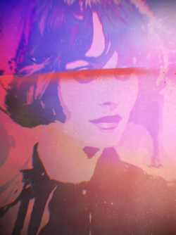
I adore that last update! I actually like the first version more. The gradient is nice and all but the random blur kind of messes it up for me.
I prefer the first as well. I just thought the second looked okay. I should have worked a bit on the tilt-shift blur that I used, instead of just quickly throwing it down.
Mitsu
Supernova
- Joined
- Oct 22, 2009
Thanks.oooo these are hot
Mitsu
Supernova
- Joined
- Oct 22, 2009
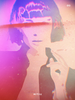
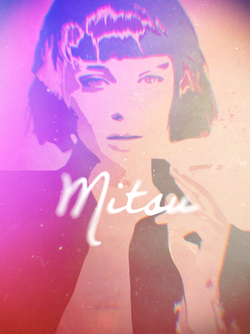
I like the second one more as it feels more blended together. The motion blur on the text is spicy af
It's interesting you say that, because I agree. It's why I went with the two versions. However, I like the first one a touch more, because the red streak makes it feel more layered and gives it a bit of depth.
I'm surprised the text blur came out so good, considering the method I used to make it was both simple and convoluted at the same time.

