 Your support makes Blue Moon possible (Patreon)
You are using an out of date browser. It may not display this or other websites correctly.
You should upgrade or use an alternative browser.
You should upgrade or use an alternative browser.
pixel factory | PHOTOSHOP
- Thread starter Mitsu
- Start date
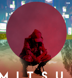
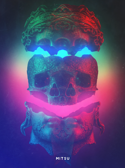
I super like it! I think the text placement is very bold but it kind of works. Only suggestion I would give is to try to balance space better. There seems to be a lot of peaceful space in the bottom and a lot of chaotic clutter at the top. I'd either get rid of some of the squares at the top or experiment with adding something else to the bottom half of the piece. Otherwise its a beautiful design. The blending is fantastic and the textures used are gorgeous.
Mitsu
Supernova
- Joined
- Oct 22, 2009
Thanks!
That's kind of what I was going for, with the more busy top and less busy bottom. It's a kind of cyberpunk sort of thing, a nature vs technology sort of theme. The top is more overwhelming and busy, while the nature is more serene. Then the middle was a venn diagram sort of thing where both can bring about a feeling of isolation. Although it would appear I perhaps wasn't so successful! It was kinda of a half-hearted sort of theme anyways! lol
Thanks for the feedback, Fruity Booty. I always appreciate it and you're spot on as usual.
Last edited:
- Joined
- Mar 18, 2019
Oooh. Does your numbering system represent anything?
These are nice.
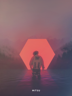
With 08, I'm not sure why, but I keep looking at it like I'd want the feet to come out of the circle, maybe staying the same red and not losing its detail.
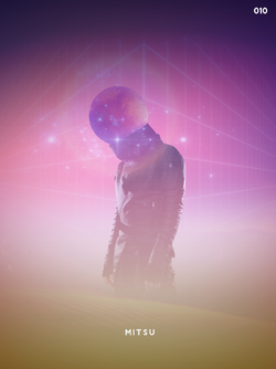
I really enjoy 10 very much. c:
These are nice.
With 08, I'm not sure why, but I keep looking at it like I'd want the feet to come out of the circle, maybe staying the same red and not losing its detail.
I really enjoy 10 very much. c:
- Joined
- Mar 28, 2020

says the one who was uninspired just the other day!? Mitsu Mittens!!!! You really outdid yourself on this one and I am so grateful to receive it. Thank you
- Joined
- Sep 9, 2015
- Location
- ʙᴀ ᴅᴜᴍ 𝙩𝙨𝙨
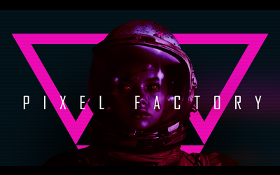
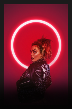
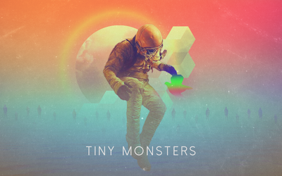
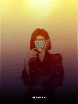
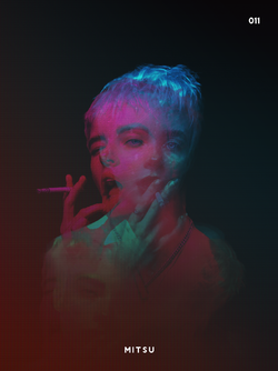
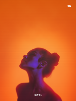
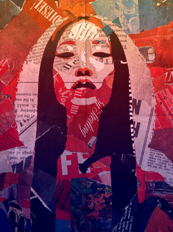
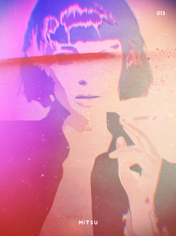
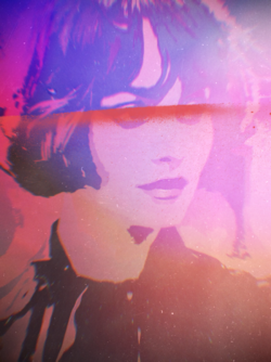
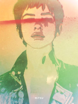
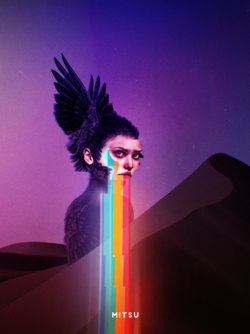
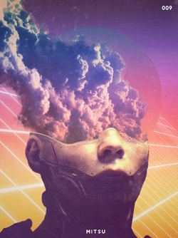
Your style reminds me of vaporwave, which I haven't seen around in a hot sec. Very cool
Mitsu
Supernova
- Joined
- Oct 22, 2009
Thanks. Vaporwave is probably one of the bigger influences on my current style. I used to use a more smudge and grunge sort of approach. Starting with the stuff in this thread, I switched to the sort of style you see now. Those last two pieces were actually quite hard, because I'm not used to working that small anymore.

