Patreon LogoYour support makes Blue Moon possible (Patreon)

• Steal Their Brush • ⇒ Graphics Game ⇐

Fruit

Best Girl
Joined
Jun 21, 2012
Location
next door
• Hello everyone! Welcome to my graphics game "Steal Their Brush!"

•The game is about trying to mimic someone's art style; this could be someone in Blue Moon, a famous artist, a video-game, etc..

• If you want to be extra spicy, you can try mashing two styles together and see what you get.

• Its just a silly little game for enjoyment and maybe practice, you don't have to master someone's style to try to mimic them.

(It might be even more funny to not do them justice)

• P.S If you mimic someone from BMR, tag them, and let them know you stole their brush! 🤍
 
Ahem, I'll start.

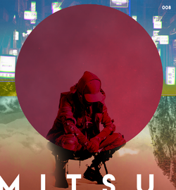
I've always struggled to copy @Mitsu 's style. Well, one of his styles. I think Neon is one of his more signature styles but he also makes pieces with interconnected abstract shapes with cool masks and gradient maps. This later style I find extremely difficult and I'm always in awe when I see some of his pieces that have that professional vibe. This is my mediocre attempt:

Ar59ZHB.png
 
You've had it on your mind to do this for quite a while. Nice to see you taking a stab at it.

I like the soft bokeh in the background. I've always liked the idea of bokeh, but could never get it to really work myself. It always ends up being a layer I delete or a concept I abandon. Did you draw in the geometric line shapes yourself? I'm asking, because the vertices in a few places are messy or off. This is a problem I've always had while trying to make them, so you certainly got the style down there! A thing I've finally buckled down to doing for the numbered and signed pieces is to make sure the text and number elements are on the same border. I've actually taken to using sixty pixels from the border of the canvas for a more unified feel. Most of the time I never bothered to do this, I just eyeballed it horribly, so it always looked a bit sloppy. I do think it's fine in this case, however, how you've implemented it.

Overall I dig it. Really like the geometric shapes and the background a bunch.
 
Goodbye my evening.

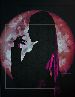
This is meant to be @Fruit's style. Less some of the content she's made for requests, which tend to have more texture, and more her 'doodles', specifically the league of legends series.

One of the main things I'm going for is manually brushing in light and shadow + some kind of color grading. The background and foreground are graded on different levels. Getting rid of the 'horn' in the bottom right corner was painful, but a good lesson. Some of the 'light effects' I went for are not super smooth, and fixing it require adjusting too many layers and I ran out of energy. It's less polished than I would want it to be, but I think I got the spirit of 'dark cinematic'? If I wanted to take this further, I would probably download some textures and try to do one of fruit's cool light particle effects, but alas, laziness struck.

borrowabrushv2.png


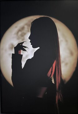
Original for comparison:
FXemCf3WQAIryb_.jpg
 
Last edited:
@Mitsu Thank you! The abstract shape was a premade brush so all I did was click once then play with blending options. I actually had no idea you made those shapes manually! That's actually super impressive! ;-;

@Retrojapan Thank you! You should have a go at it too. Mitsu's brush is very fun to steal c:

@ƒeral Wow, that's actually an insanely good attempt! There is very little I'd have done differently (blur the background because the flying orbs steal a lot from the focal point, add some overlays to spice it up a bit, maybe cinematic bars for a border, and play with the text a bit and place it elsewhere) but the color-grading and the lighting are spot-on! I also love your choice of font! Good job!
 
I too have tried to emulate @Mitsu .....

For our last sabotage, actually. I pulled from several of his pieces for it and he still beat me with a move I've never even seen before 😒

Retro​
Text​
Blinds + Gradient​
Overlays​
e8iNchL.png
lYNgWN1.png
16358
16357-b7393cfb8830b2c3f318830e0539b61d.jpg
 
I have stolen Retrojapan's brush!
I really had fun trying to capture @Retrojapan's essence. I did my best to find some
retro textures and add some retro aesthetics...Retro, with a hint of Saber.


retrobrush.png

 
@Retrojapan Your graphic is still one of my favorite pieces I've ever seen on BMR. Its just so stunning 😭

@Saber That's super cool! I think its a lovely mash up of yours and hers styles. The bonus text is very very good too! 🤍
 
I am not participating, but I wanted to say I love all the art here and seeing you guys try each other styles. ♥ I think you're all amazing!
 
I too have attempted to wield the fabled brush of @Retrojapan
....It has corrupted me

Original​
Retrofied​
tsa0HAD.png
qTIdAhv.png

I actually think I've mostly stuck to my own comfort zone with this? As in I used my normal techniques / brushes to try and replicate Retro's style, but I don't think I actually.. um.. used her techniques? No brush has been stolen.. maybe..??
 
Last edited:
I too have attempted to wield the fabled brush of @Retrojapan
....It has corrupted me

Original​
Retrofied​
tsa0HAD.png
UxTtVzm.png

I actually think I've mostly stuck to my own comfort zone with this? As in I used my normal techniques / brushes to try and replicate Retro's style, but I don't think I actually.. um.. used her techniques? No brush has been stolen.. maybe..??
From my own personal views, I honestly find yours and Retro's style the hardest to emulate. Mainly because you've both been so versatile. I think you did a great job merging both of your styles. I think the splattering and color over the subject's eyes are very retro.
 
I too have attempted to wield the fabled brush of @Retrojapan
....It has corrupted me

Original​
Retrofied​
tsa0HAD.png
UxTtVzm.png

I actually think I've mostly stuck to my own comfort zone with this? As in I used my normal techniques / brushes to try and replicate Retro's style, but I don't think I actually.. um.. used her techniques? No brush has been stolen.. maybe..??

What the hell!? THIS IS BETTER THAN RETRO STYLE 😤 😭 How am I supposed to compete!~?
 
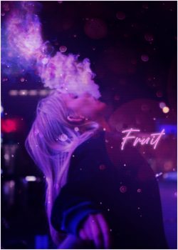
I tried my hand at stealing Fruit's brush
fruit.png

Since @Fruit is so versatile, I had a hard time working on this, so
I just took a few different elements from past projects into this.
I'm still not positive I'm channeling that Fruity energy.

 
Oooh that's good! That color-grading and text are very reminiscent of what I'd do. The circle behind the text is such a lovely touch too! 🤍 If I may offer a tiny suggestion, your splatters are kind of in a too uniform pattern. Try using different brushes with different sizes and orientations to get a more random formation, with maybe the big splatters in the middle and the smaller ones randomly thrown around it c:
 
Oooh that's good! That color-grading and text are very reminiscent of what I'd do. The circle behind the text is such a lovely touch too! 🤍 If I may offer a tiny suggestion, your splatters are kind of in a too uniform pattern. Try using different brushes with different sizes and orientations to get a more random formation, with maybe the big splatters in the middle and the smaller ones randomly thrown around it c:
Thank you! I always appreciate any feedback you guys have to offer :D
 
Once again I stole @Mitsu 's brush. I had so many different ideas for this particular image! I'm tempted to go back and play with it more.

PQThc5R.jpg
 
Once again I stole @Mitsu 's brush. I had so many different ideas for this particular image! I'm tempted to go back and play with it more.

PQThc5R.jpg
This radiates Mitsu! I love it! You did an awesome job down to his text placement.
 
Once again I stole @Mitsu 's brush. I had so many different ideas for this particular image! I'm tempted to go back and play with it more.

PQThc5R.jpg

Neato.

What's funny here is that the original idea for the one that inspired you here is that I was going to go with a forest road surrounded by water kinda like the composition you have here. So, you really hit the mark a lot closer than you probably think. lol

The single cloud up above is a surreal touch that only adds to the surreal flavor of the rest of the image, so I like that a whole lot.

I do wish the text was all the same distance away from the border of the image though.

This radiates Mitsu! I love it! You did an awesome job down to his text placement.

lol Always about the text placement with you.
 
@Saber Thank you so much! I'm glad you thought it was a success. I had a lot of ideas for that picture and wasn't sure which to go with; nice to know I picked well! c:

@Mitsu I'm happy you approve! The cloud was something I was SO skeptical on but eventually decided to keep it there. There is a lot of small imperfections here and there because this started as a random project that I didn't think I'd post, but then I turned it into something for this game. The portal isn't perfectly symmetrical/centered, the walkway wasn't perfectly masked, etc.. Its not well polished but I was too tired to care about going back and cleaning it by the time I decided it was share-worthy lol
 
Back
Top Bottom