Patreon LogoYour support makes Blue Moon possible (Patreon)

Question How to Center Text in Tab Buttons?

Lewd Tales

A proprietor of lewd adventures!
Joined
Oct 24, 2015
Location
A Lewd Hole, Somewhere
Hello!

I'm trying to revamp my LFRP thread and I love using the Tabs BBCode. I recently saw that someone was able to actually center the text for the tab text itself, though I don't seem to be able to do it consistently. Does anyone know how to get this to work consistently?

It makes the tab BBCode look so much nicer (namely because the buttons are too close together by default and don't look like buttons)!

Example for what I want

1691093572022.png

Example for what I get

1691093651098.png


I tried to do Alignment Center, but that makes the text go from tab text to Slide 1. Forcing spaces before and after or even between the letters/words also didn't work. I'm kind of stumped.
 
So, this may not be the best (or even most sensible) way of doing this, but I fiddled around with my thread to see what I could do.

See here: Mobile view, I was able to give the different tabs a center appearance by adding some Opacity Text; [Opacity=0]. There's literally the capital letter D, set to invisible, acting as a pad/buffer between the tabs.
Screenshot_20230803-192020_Chrome.jpg

See here: Mobile Desktop view. As you can see, everything isn't quite centered when the resolution of the page is expanded. This is also true for True Desktop view (on your PC, or laptop).
Screenshot_20230803-192101_Chrome.jpg


These are imperfect solutions, jury-rigged together in the last hour or so, but you're free to use them.

Update:
If you're using the standard "plug-and-play" method of Tabs/Slides, each tab after the first will likely not be a [slide_header] type Slide. For each tab in the window, you'll need to create a new Slide_Header; this will give you freedom to colour, and adjust the text in that tab, and also allow for these opacity spacers to be effective.
 
Last edited:
So, this may not be the best (or even most sensible) way of doing this, but I fiddled around with my thread to see what I could do.

See here: Mobile view, I was able to give the different tabs a center appearance by adding some Opacity Text; [Opacity=0]. There's literally the capital letter D, set to invisible, acting as a pad/buffer between the tabs.
View attachment 31021

See here: Mobile Desktop view. As you can see, everything isn't quite centered when the resolution of the page is expanded. This is also true for True Desktop view (on your PC, or laptop).
View attachment 31022


These are imperfect solutions, jury-rigged together in the last hour or so, but you're free to use them.

Update:
If you're using the standard "plug-and-play" method of Tabs/Slides, each tab after the first will likely not be a [slide_header] type Slide. For each tab in the window, you'll need to create a new Slide_Header; this will give you freedom to colour, and adjust the text in that tab, and also allow for these opacity spacers to be effective.

Hmm. Interesting. I do the plug-and-play method. I can confirm it's just the following:

Code:
[tabs]
[slide_header] Boop [/slide_header]
[slide]
[/slide]
[/tabs]

When I use this though, I can't get the text to center no matter how many spaces I put between the words, on the ends or in between the letters.


Whitespace? Could you elaborate on what you mean, please?
 
Hmm. Interesting. I do the plug-and-play method. I can confirm it's just the following:

Code:
[tabs]
[slide_header] Boop [/slide_header]
[slide]
[/slide]
[/tabs]

When I use this though, I can't get the text to center no matter how many spaces I put between the words, on the ends or in between the letters.


Whitespace? Could you elaborate on what you mean, please?
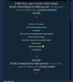
Right. The way your code is now, each Slide after the first one doesn't have the Slide_Header tag. This is why trying to edit the colour, shape, or variety of the text will screw up the Tab.

See here: a screenshot of the code in my thread. I'm using a Slide_Header for each new Slide; this differentiates between the Header for the slide (the coloured, stylized portion) and the text in the slide (regular text, or images, or whatever).

You'll need to re-work your code to get it to cooperate.
Screenshot_20230803-224434_Chrome.jpg
 
Last edited:
Right. The way your code is now, each Slide after the first one doesn't have the Slide_Header tag. This is why trying to edit the colour, shape, or variety of the text will screw up the Tab.

See here: a screenshot of the code in my thread. I'm using a Slide_Header for each new Slide; this differentiates between the Header for the slide (the coloured, stylized portion) and the text in the slide (regular text, or images, or whatever).

You'll need to re-work your code to get it to cooperate.
View attachment 31025


Ah, I see. I did attempt that as a test, but the tab buttons still seem to be stuck left justified.

Code:
[tabs black_align="bcenter" width=500px]

[slide_header][Opacity=0]D[/opacity] Test Tab [Opacity=0]D[/opacity][/slide_header]

[slide]

[/slide]

[slide_header][Opacity=0]D[/opacity] Test Tab [Opacity=0]D[/opacity][/slide_header]

[slide]

[/slide]

[slide_header][Opacity=0]D[/opacity] Test Tab [Opacity=0]D[/opacity][/slide_header]

[slide]

[/slide]

[/tabs]

It results in this:

1691118327071.png

My ultimate goal is to try and getting the tabs themselves centered, not the content inside of the tab/slide necessarily. I know I saw someone be able to do it when looking at someone else's LFRP thread.

Do you think I just need to add more spaces?
 
More spaces, or whitespaces (as linked above) will give the illusion of your tabs being centered -- but I don't know of a way to get them actually set to middle. This has been my inherent issue with getting things to work across Mobile and Desktop views. The space required will vary depending on length of text in the Slide Header.

But, again, this is just sort of a workaround. If someone from the Design Team, or anyone with in-depth knowledge, knows of a way to get tabs centered, I'd love to know too. It would make my life a lot easier, lol πŸ˜…
 
You can't. BMR doesn't support the options/framework needed to do it differently (afaik). White space or EM space is the only option inside tabs. " " <Flee free to copy what is in between the ""


Thanks! I'll copy that. I still dunno how you made Whitespace/EM but I don't think that matters since I can just copy it.
 
I honestly just copy&pasted it myself. But if you have a numpad on your keyboard it is alt + 8194 for an En Space and alt + 8195 for Em Space. There is also alt + 255 for a nonbreaking space but that one is only the size of a normal space.
 
Back
Top Bottom